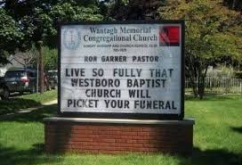
I saw a church sign online in the middle of the night last night when was looking for something really boring to help me fall asleep. One thing led to another like these things often do.
Here’s the one that got me started.
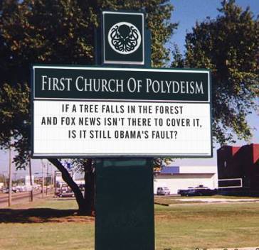
I have no idea what to make of a church whose signage calls it the First Church of Polydiesm. First? Are there others in some sort of numerical hierarchy?
I know that deism means believing that a deity created the earth and then pretty much lost interest after that. So, I suppose polydeism means a bunch of gods lost interest. Okay.
Still and all, their recent attention-getter got mine:
I always think that church signs that look like marquees are a bit off-putting. Like who’s preaching on Sunday and what the title of the sermon is.
There’s one down town here that used to look a lot like a movie sign. After they remodeled (The place now just looks like any other secular barn-like edifice.), their new sign makes the place look more like a casino.
Another local church every Christmas (Actually, they put it up on Thanksgiving.) displays a large plastic banner that reads, “Mary had a little lamb.” All righty, then.
The visuals that churches have used for two millennia have caused consternation. I love the word “iconoclast.”
Some can’t possibly be designed to encourage the attendance of newcomers:
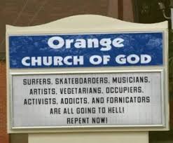
Vegetarians? Seriously?
Jesus must be so proud!
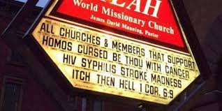
This one is would certainly discourage anyone who can spell:
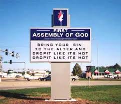
In contrast to this one:
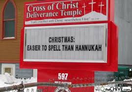
Some are inappropriate attempts at humor in addition to having apostrophe problems:
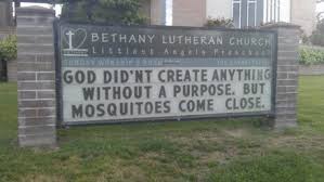
Cute:
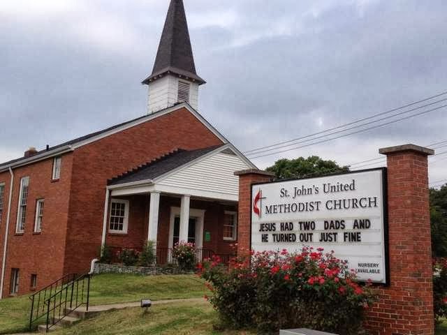
And my personal favorite: